Vimeo’s Advanced Stats platform allows users to get insights into how people are engaging with their videos via several different report pages.
The infamous stats project was a huge project that I worked on with many people from various departments of the company. Having worked on the original MooTools based stats platform, it was about time for a revamp. The original platform served us well however after five or six years, it was definitely time for a technological and foundational upgrade. Very special shout out to the very talented product designer, Anthony Irwin for enduring on this journey with myself and everyone else involved.1 Also I’m stealing some of your mock ups for this post. Thanks man.
This project was second React based project at Vimeo. Having read a bit about React myself over the past year, I knew even though it was only at version 0.13, people were really enjoying using the component-based library for single page apps. It seemed stable enough to bring to the project. Since some developers on the project were familiar with Backbone we used its Model and Collection classes for the data layer in combination with the React for the UI layer. I didn’t know much about either library before this project but the whole platform was a learning experience for everyone to say the least.
Dashboard
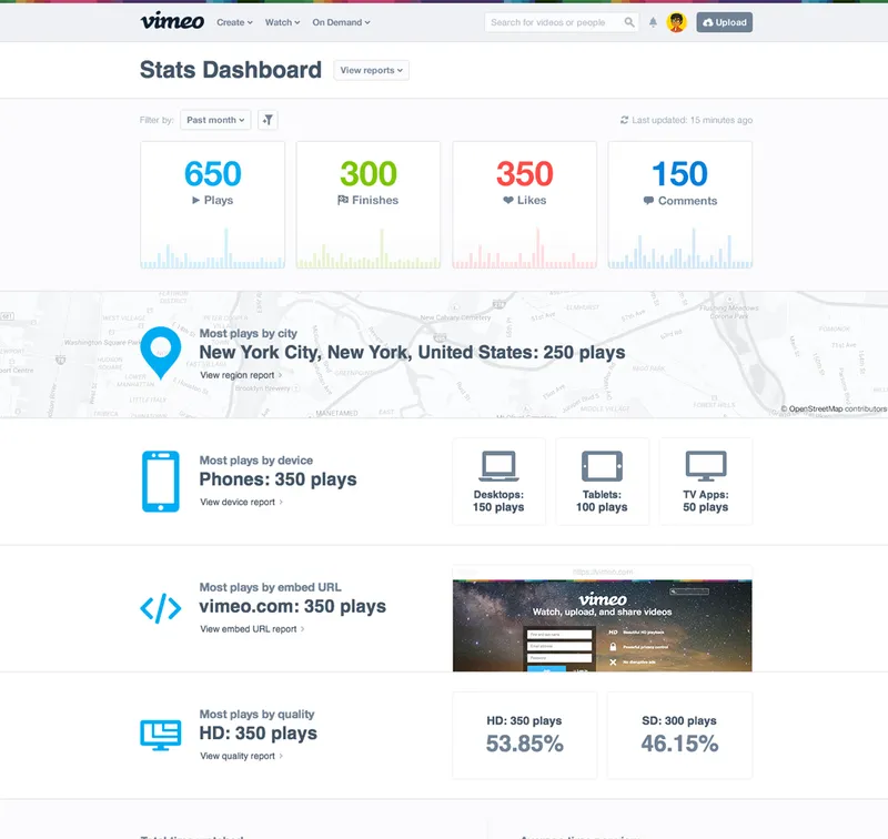
The dashboard shows a bird’s eye view of the various video metrics a user might be interested in seeing. This view sets the stage for the other succeeding reports a user may view which each section linking to said reports. What reports a user can see depends on the user’s account type, whether it be basic, plus or pro. Each invidivual report may have certain parts that are made unavailable to non-pro or non-plus members. The screenshots below will show reports with everything unlocked.
Report Pages
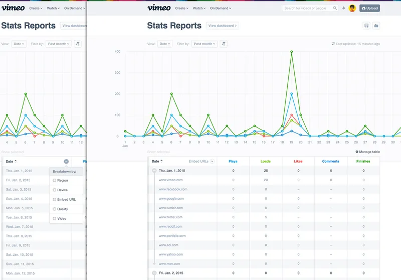
One of the first reports a user will see and arguably one of the most fundamental report pages is the Date Report. This report lets you break down your video stats by… wait for it… the date. This report also showcases a lot of the components that make up the stats platform as a whole. Components such as the filter dropdown above the graph, the “Manage table” button below the graph and of course, the table.
The custom table itself is pretty loaded in terms of feature set. By clicking “Manage Table”, you can control what columns are shown in the table for any report. You can sort each column as you’d expect and for the first column in the table for each report, you can break down the content by a second dimension. In the case of the Date Report above, you can see the stats for January 1st along with all of the embedded urls that made up the stats for that day.
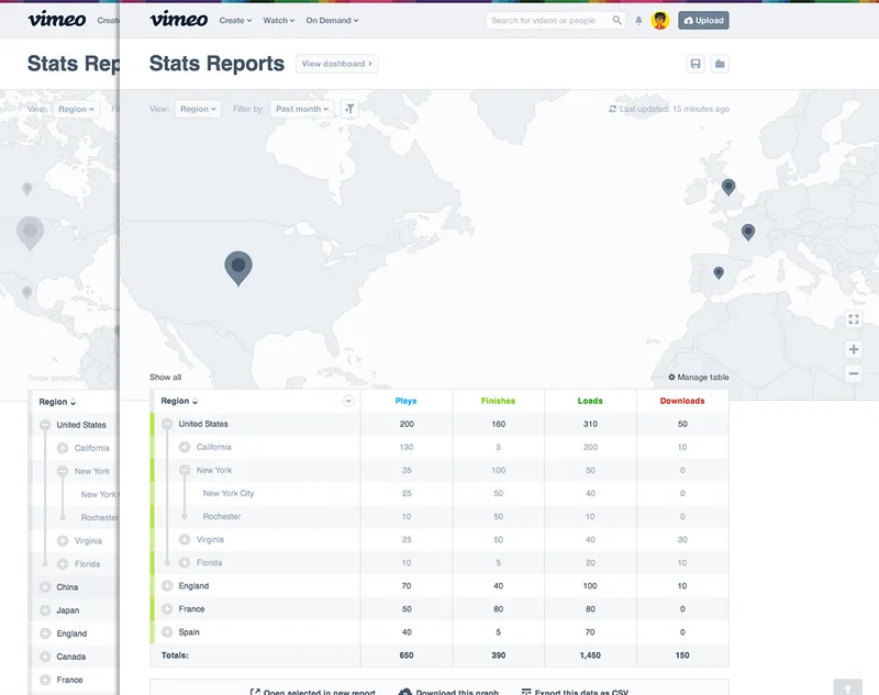
One of the more impressive looking reports was the Region report. This report allowed you to see where in the world people were watching your videos, from the country level all the way down to the actual viewer’s address. Okay so maybe not the viewer’s address, but the city is close enough right? With any report you can also select and filter table rows which changes the graph or map in the stage area. From the Region Report above you can see the four countries selected in the table are reflected on the map.
The previous version of stats had a region map but it was flash based until I converted it to SVG using some public domain World GIS Data, random SHP files from the internet and QGIS. I’m by no means any type of cartographer but I did get it “working”. The problem was that each country’s border was not very detailed and zooming in on the map showed that. It might not seem like that big of a problem initially but being a user facing site with millions of active users around the world will quickly make you realize how important country borders are. [Insert Trump pun here]
We explored many different mapping options this time around. We know we wanted something more detailed than the harshly shaped countries we had before but having details like streets and their names was not that important. Ultimately we ended up hosting our own custom styled version of OpenStreetMap wrapped and packaged with the amazing Leaflet.
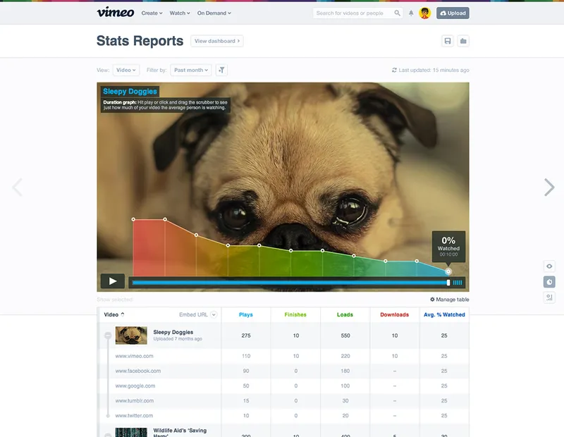
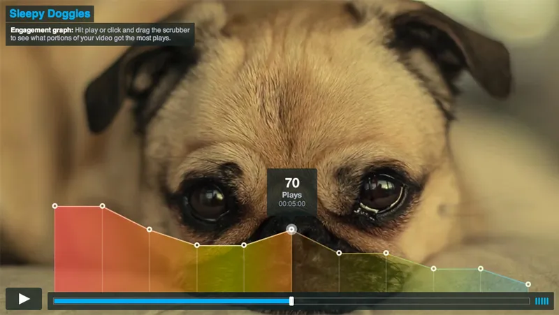
The platform in general made heavy use of Highcharts with a lot of custom work built on top of the default options to get the look and feel that we wanted. The video report shown above is a result of some of the custom edits needed to achieve the desired result. The video report has three different toggleable views as demonstrated by the buttons in the lower right hand side of the video area. The screenshot above shows the duration graph which lets a user know which parts of the video a viewer watched and where the general population of viewers may have gotten bored.
But of course nobody gets bored of your videos. Check it out for yourself at vimeo.com/stats.
Anthony also wrote a post about the design process if you’re interested.